Night at the Museum Reflection
Night at the Museum Reflection
GOALS:
Night at the Museum is an event that takes place at Del Norte near the end of every trimester, so that people in project-based classes, such as studio art, photography, ceramics, computer science, and many other unique courses can showcase their projects which they have put hard work into for the past few months and also take a look at other people’s work to gain inspiration and insight into the perspectives of others in art and creative thinking in general. Before going to N@TM, I had a couple of goals which I wish to showcase in this blog post:
-
I wanted to successfully showcase our group’s AP CSP project to the audience, and answer other people’s questions about our project to the best of my abilities.
-
I wanted to take a look at other people’s projects within our own AP CSP Class (Mr. Yeung’s Period 4 Class). After all, we have spent the entire trimester in this class, and I was very interested to see what other groups within the class had come up with, especially after the midway CPT presentations which took place a couple of weeks ago.
-
I wanted to look beyond the realm of just CSP, and look into CSA projects. I wanted to assess the different ideas that they had, and see how they utilized and combined the programming knowledge they learned from both CSP and CSA to make a next-level project.
-
Finally, I wanted to look past Computer Science, and take a look at some projects that were more “art” related. Some of the arts classes which had classrooms dedicated for their projects at N@TM were ceramics, photography, and studio art. I wanted to see if there were any crossovers/similarities in the ideation process and work towards the final product between these projects and our own Computer Science projects, despite the classes themselves being very different.
OUR OWN CSP PROJECT: JNVS NEWS:
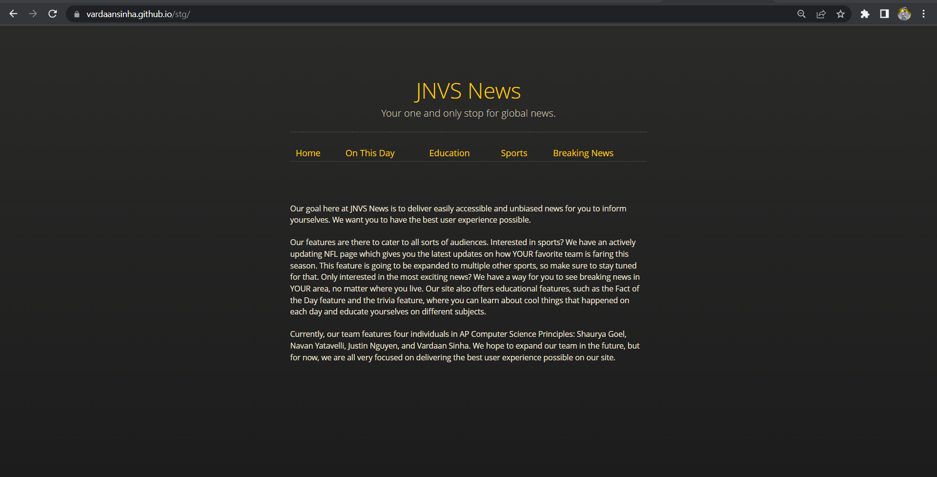
JNVS News is a project that myself, Justin, Shaurya, and Navan have been working very hard on for the past few months. Leading up from the past couple of weeks into N@TM, we were having a lot of difficulties, mainly in regards to connecting our frontend to our backend and deploying. Luckily, we were able to figure out a lot of errors and their solutions before the time for N@TM came. Our news site ended up being functional, and every feature (except mine unfortunately) was running off of our deployed Flask server. At N@TM, we had a lot of people come up to our project, take pictures, and ask about the different features of our project. Fortunately, all of our members were present, and we were able to effectively explain all of our features and how they correlated with each other to both people who were programming experts and those who had no programming knowledge.
If there is something I would change for the next time, I would make sure that we put more effort into the visual appeal of the site before the presentation. For an audience that contains many people who don’t know a lot about programming or the difficulties of creating certain features, they will mainly be drawn by a project that looks visually appealing and professional.
RENTAL RETREAT: Mr. Yeung’s Period 4 CSP Class (James, Krishiv, Caleb, Qais):
N@TM Presentation & Experience:
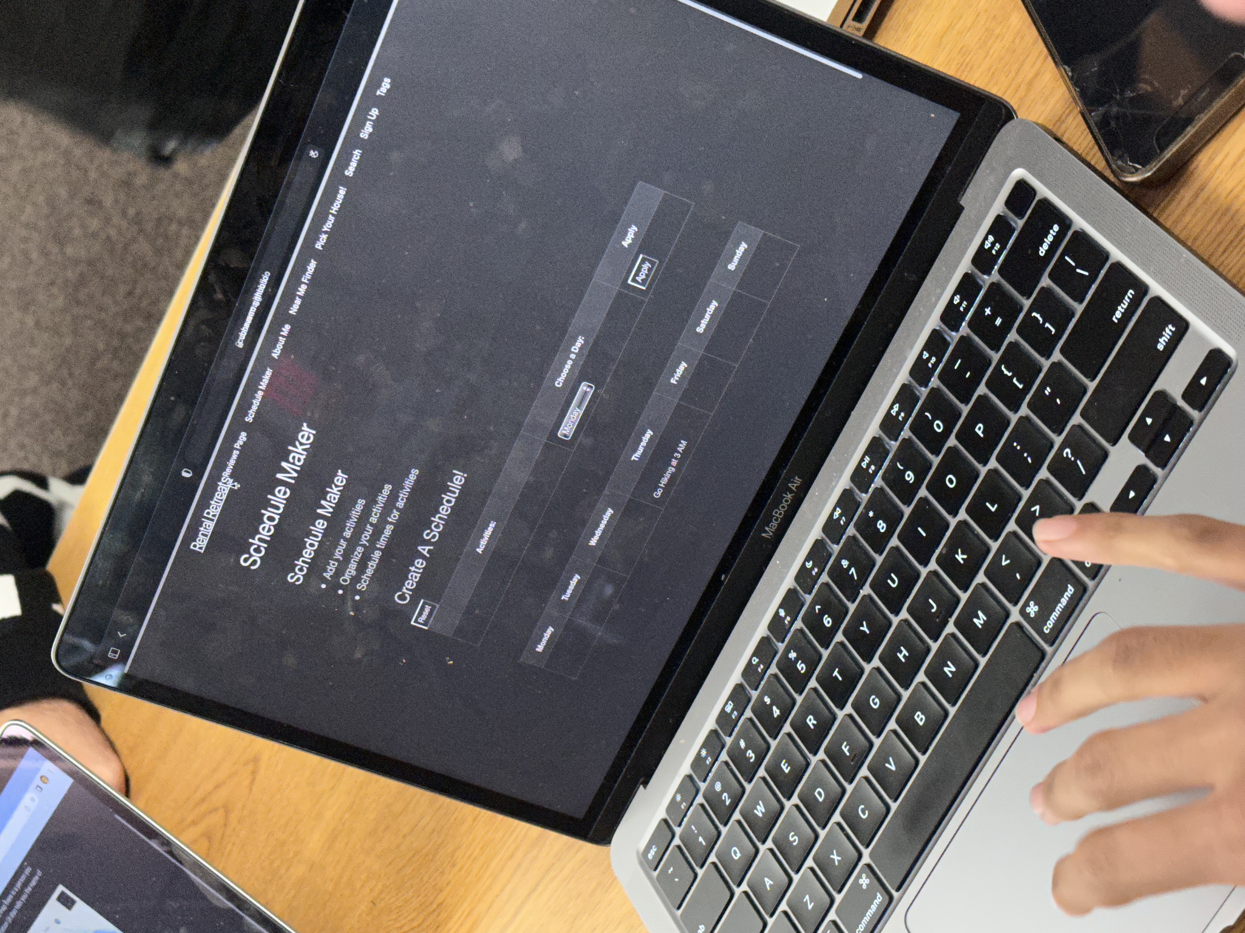
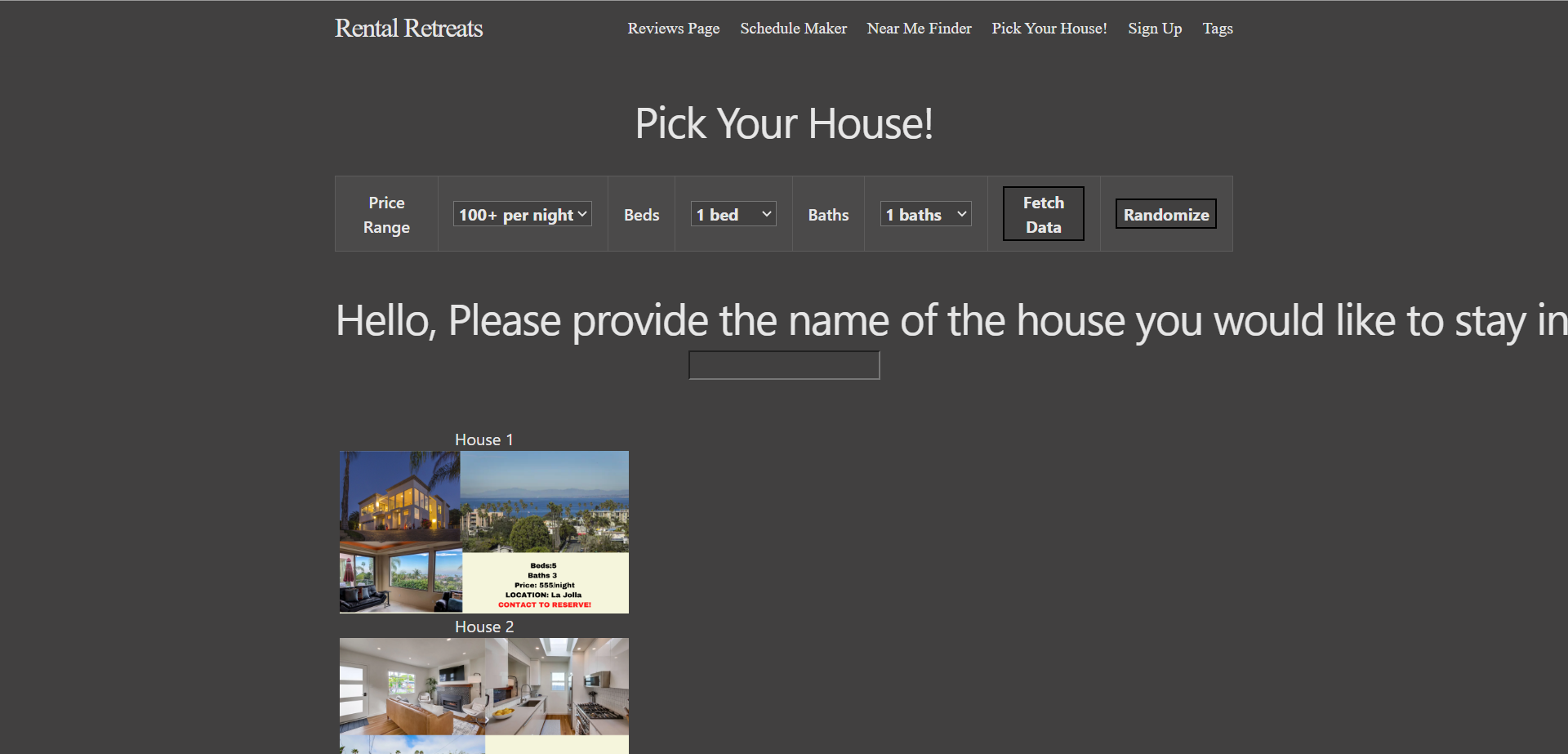
The Rental Retreat group had their project set up to present in the same room as my group (A151), and this was a project that I had offered feedback on throughout the last few weeks, so I was very excited to see the product that they were presenting at this point. I was initially caught by the slogan they had on their home screen: “The place where your vacation finds perfection”. This drew me in even more and made me more interested in looking at their project. This inspired me directly for my group’s news project; maybe we could have a catchy slogan which would make our project more authentic and interesting to our consumer audience. Anyways, after further inspection at their project, it seemed that they had a couple of main features: a schedule maker for someone to plan their time on vacation, a “Near Me Finder” to look at nice vacation and tourist spots near a person when they are out of town, a feature to search for open property to stay in when on vacation, a place to create an account to use the product whenever you go on vacation, and finally, a place to put in honest reviews to give the group feedback about their product and about their stay while on vacation.
The feature I enjoyed playing with the most was the Near Me Finder. With this feature, I was able to use the Google Maps snippet on the site, and there were tourist sites labeled all over which I could visit. This would be an incredibly useful tool to use if I was on vacation, and my family was unsure as of where to go. Also, with the maps feature, came the little person in the bottom right corner which could be dragged to any area on the map to provide a closeup view of the area that I was interested in. Overall, their group did a very good job of explaining the project to me, and I hope to see a more “professional” look of the project and a more fully functional version of the product in the next couple of weeks, as this is a project that would be very useful to tons of people with the unique collection of ideas that this group has attempted to connect.
Further Inspection of Project after N@TM:
After N@TM, I was curious about a couple of features in regards to their project, so I decided to take a closer look at their frontend and backend repositories. Here were some of the interesting findings I had:
-
I was very impressed with the required frontend code for the Google Maps API. I know that a member of my group (Navan) also implemented this feature earlier for the Breaking News feature, so seeing how the two features were similar/different was very cool. In our project, Navan used the Maps API to track breaking news in different areas, and in this case, James (the one in charge of the maps feature) used the Map API to plot different tourist and vacation spots, which was very cool. It required a lot of extra code to implement, and I was impressed with the level of research that was likely done to successfully implement it.
-
I also looked at the backend code for this project (Krishiv’s Repo) and inspected the /api/user.py file, which contained a lot of the backend code for the CRUD methodologies and the error validation for the property finder feature. I found it interesting to see some of the similarities to the code structure of the /api file with my own project, but I also saw that this group had developed the handling of incorrectly formatted information a lot more than my own group. For example, in the backend code, I can see that for the property finder feature, there are certain inputs that are not accepted for each of the inputs that the project is asking the user. In specific, the property finder asks the users how many beds & baths they would ideally want, and the price range they would be able to afford. In the backend code, all three of these inputs are addressed, and if one of the inputs is accidentally left blank, then the project will output an error message, causing the user to put in valid inputs to find a property.
- One thing that I was curious about was the login/signup page, and how they are going to a) find enough time to finish that entire feature and b) save that account information and link it to past properties that a user has been interested in & vacation plans that a user has already inputted. I hope to see this group become successful in implementing this feature, as this project will then become even more elevated than it already is.
CODE CARDS: Mr. Mortensen’s Period 2 CSA Class (Aarav, Rohan, Nick, Andrew, Bailey):
N@TM Presentation & Experience:
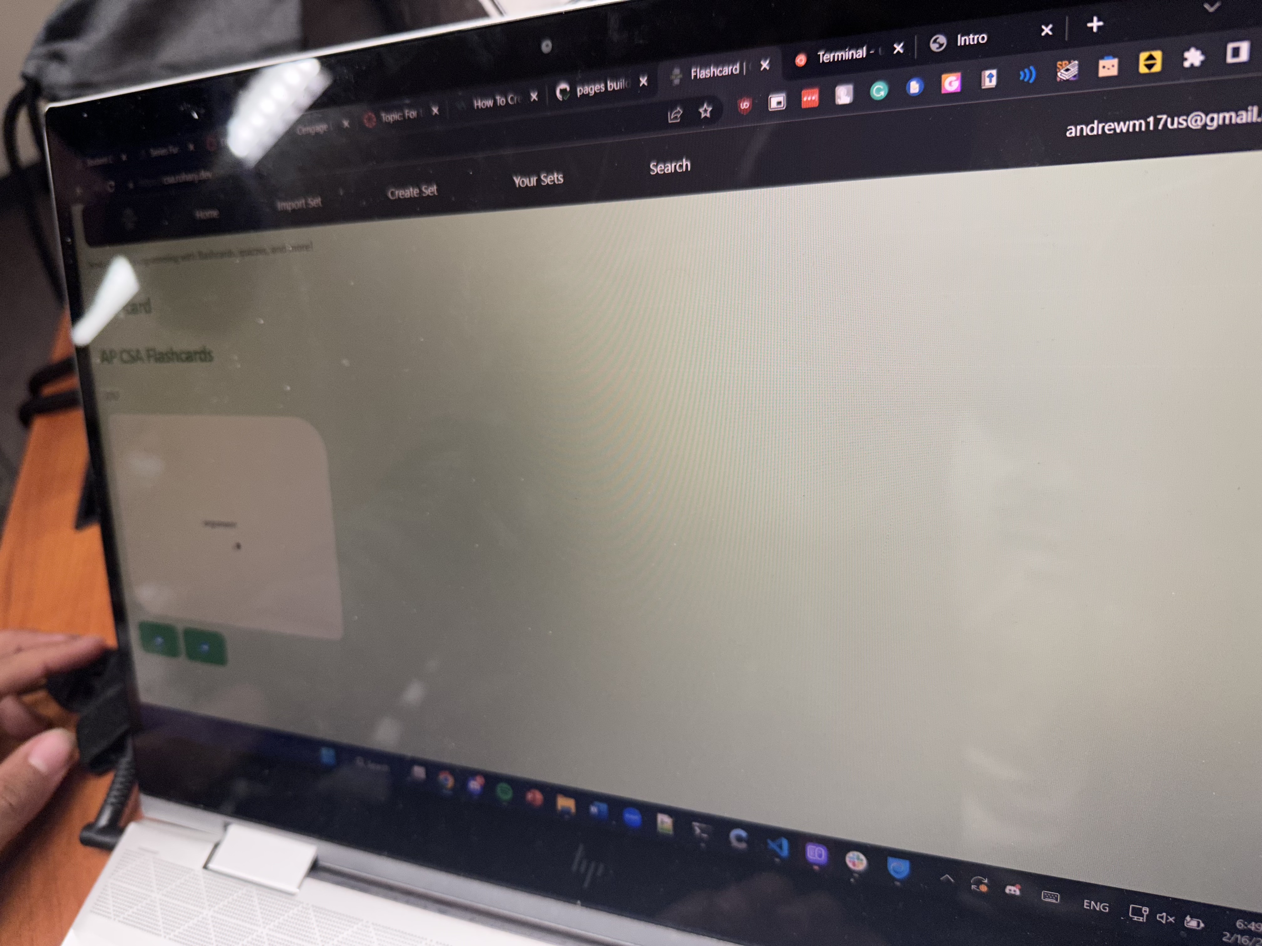
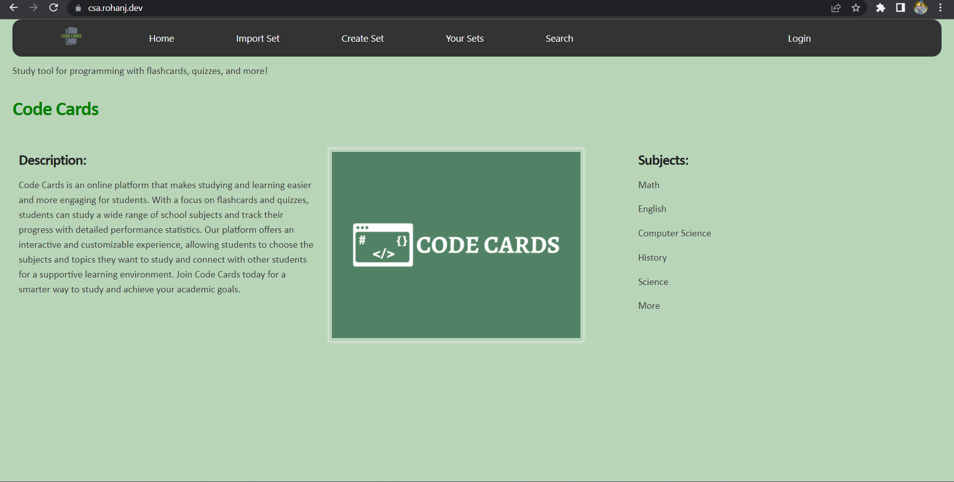
With this presentation, I was super impressed by how fluent all of the members of this group were with the backend and frontend connection and how each of the features of the project works (despite each of them working primarily on their own feature of the project). This project, code cards, is essentially made to be a much easier version of Quizlet. You may be asking; what is the point of code cards when Quizlet already exists? Well, now that Quizlet has a) been made to be a paid service after viewing a certain number of quizlets and b) cannot use the flashcard feature on Quizlet effectively to figure out the specific concepts they need to work more on, this group decided to create Code Cards for aspiring learners of all ages. All of this group’s runtime links worked efficiently without crashing, and had all their features working like an actual project. Using Java, Python, JavaScript, and a good bit of customization of their frontend using HTML/CSS, they were able to create a working login/signup page where you can create your own account for your created study sets or sets that you’ve already been taking a look at, and get to work immediately.
At the N@TM experience, I created my own account on their machine and tried out a study set, and they showed me how this product overtakes Quizlet. On Quizlet, with the flashcard feature, you cannot specify whether or not when you flipped the card, you got the definition/answer correct or not. On Code Cards, however, you can do just that, and that stores that specific term/flashcard for later instead of skipping past it. This really helps to learn from mistakes that you make when studying on a particular set. I also tried searching for study sets (which were being fetched from Quizlet), and the project flawlessly outputted all the Quizlet tests, flashcards, and content from each study set in an appealing and working manner. I really enjoyed this project, as the group let me go hands on with testing out their project, which made me more invested in it.
Further Inspection of Project after N@TM:
After N@TM, I decided to take a closer look at the project and the different frameworks that it utilized in comparison to CSP. Here are some of the things that I found:
-
Instead of using flask, they use Spring, which is a framework which supports the development of applications being run on Java. This makes sense, as CSA primarily uses Java for their code.
-
Something interesting that I saw in their frontend code was that after they fetched the data from their deployed Spring server, instead of pulling from a list, they were actually pulling from a dictionary. In the frontend code, I saw that it was pushing the output as a key/value pair, which is something we learned a bit about in CSP when we talked about Python dictionaries.
This is definitely a project I want to look more into and was inspired by, simply because of its appeal to the audience and its flawless functionality.
PHOTOGRAPHY AND 3D ANIMATION 1/2 PROJECTS:
N@TM wasn’t just about computer science. There were also other arts classes presenting their body of work, and the two classes I decided to take a look at were photography and 3D Animation. These exhibitions were a little bit different, as there weren’t any students necessarily standing next to their work and presenting it, but it was rather a “gallery” which we could walk around and look at different projects.
Having dabbled in both photography and 3D animation (inside and outside of school), I was interested to see the different works that my peers had come up with.
For the photography projects, there were a lot of interesting pictures which provided different perspectives of different objects. Something that really stuck out to me was the angles that many of the students decided to use; the angles really put a different spin on commonplace objects that would generally appear to be boring. For instance, there was one photo of a basic VANS shoe, but the angle, lighting, and slight editing which was put on the photo forced me to actually think about it, and it took me a minute to realize that it was just a shoe.
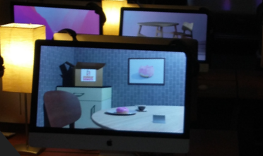
After looking at a lot of photographs, I looked at the 3D Animation projects, which are created using an application called Blender. I personally had done 3D Animation 1 back in my freshman year, so I had done the course, but was unable to do the N@TM portion because of the pandemic. The main project for 3D Animation 1 is the donut project, where you can style a donut to make it look as realistic as possible, and style the setting as well to make it seem like an authentic and beautiful setting where you could sit down and eat a donut. One of the projects which stuck out most to me was a setting by the sea. The donut was set on a table with a white tablecloth, white plate, and gold plated utensils, and it was in a room painted light grey, and the room had a window. In this window, there was a view of a mixed blue, which was meant to look like the ocean. This project was incredibly appealing to me, and I saw the effort that the creator had put into the project, which is why it was very cool to see.
FINAL REVIEW:
Overall, I had a very good time at N@TM. I got to meet a lot of new people and look at a diverse range of projects, and regardless of the class or project that I was taking a look at, I was able to gather new ideas and perspectives that I can apply to my own life and project for AP CSP.